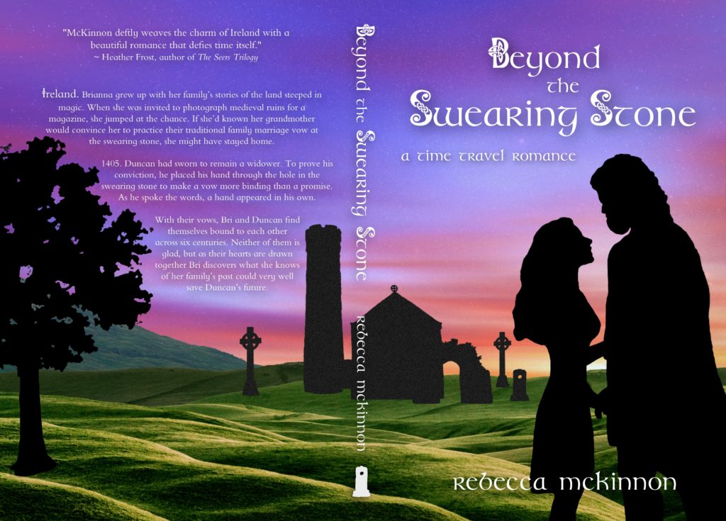
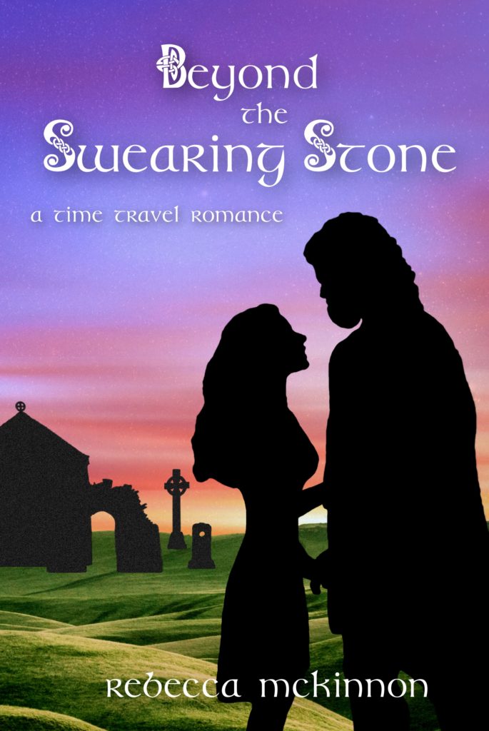
Did you know I design all my own covers? It’s a part of the process that I truly love. I thought this time, instead of just showing you the finished cover I’d give you a glimpse into how I went about building it.
First I’m going to show you the finished product (full cover, then front cover), because I just can’t make myself drag it out. I’m too excited to share it with you! I hope you love it as much as I do.
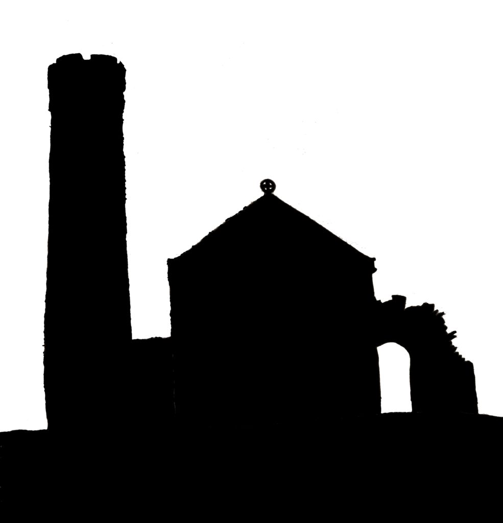
When I start to design a cover, I try to get a few ideas in my mind of what might work. Because the swearing stone at St. James’ Church in Ireland is so pivotal to this story, I knew I wanted to include something from the churchyard. So I started by drawing the basic shapes of the church and other features. I ended up with this silhouette.
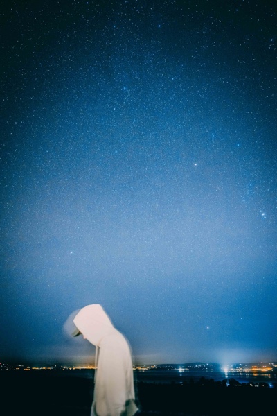
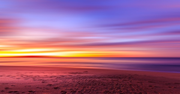
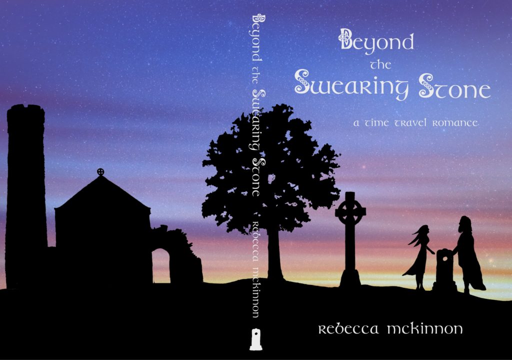
After that, I sketched a few other things (and people) to create this mock-up. For the background, I looked at stock images. It was hard for me to consider using because I’ve always tried to make my covers from scratch. But for the mock-up, I told myself, it would be fine. I ended up using one of the night sky, but I wanted more color. So I found a sunrise (it might have been a sunset?), and I made it transparent over the night sky so I could still see the stars. This is what the mock-up ended up being.
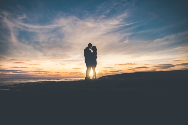
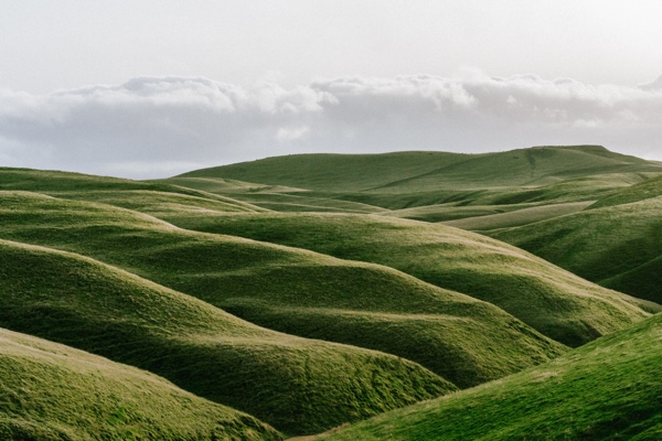
This would have worked — the people and the swearing stone were on the covers, as well as one of the high crosses to help know visually that this takes place in Ireland. But there’s not much depth, or color, to it. So it was back to looking at some stock photos. I found one of a couple that would work — with some editing. Lucky, the website I downloaded all the images from allows editing. I also found some green hills and mountains.
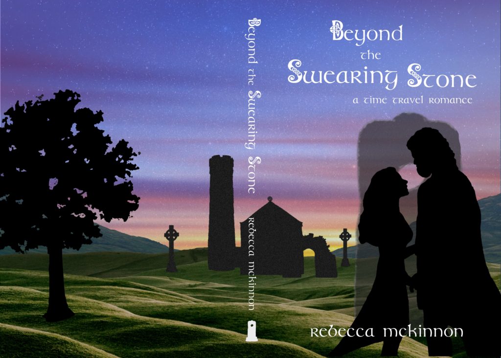
You’ll notice that giant version of the swearing stone behind the couple. Eek! I’d hoped it would help draw the focus to the connection between these two, but it was awful. I did like having the church visible on the front cover, so I kept that, and made the swearing stone just part of the background with the churchyard.
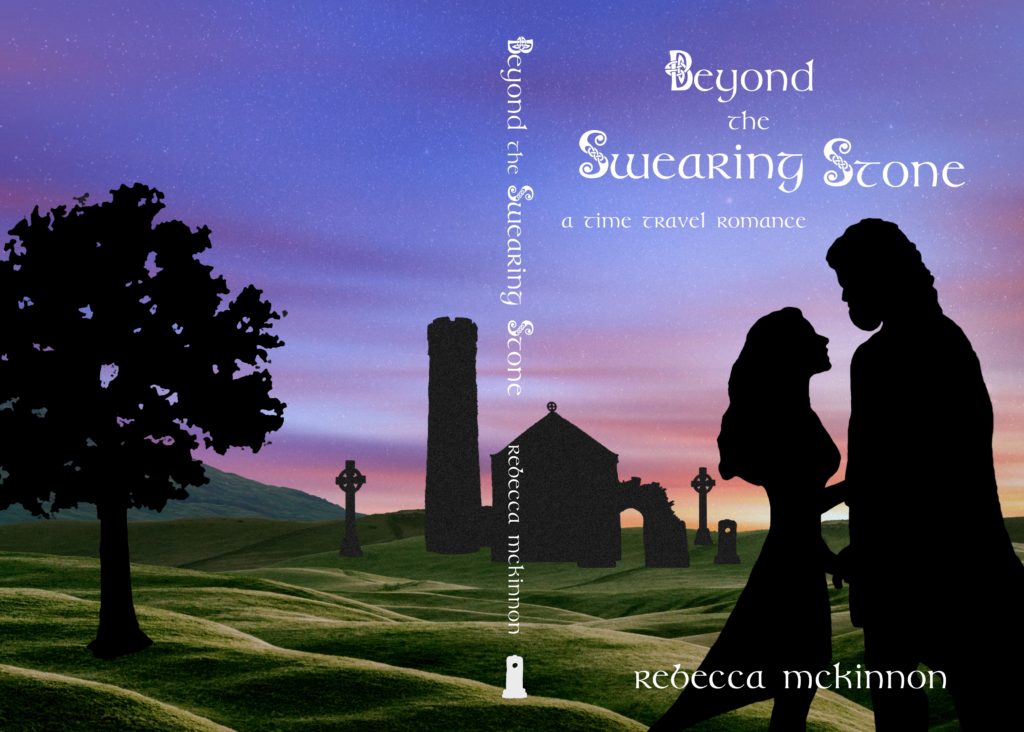
With this, we were almost there. Just a bit more tweaking. I changed the shape of the woman’s skirt, and brightened the hills and the sky. Then I added on the back cover copy, and finally we were there!
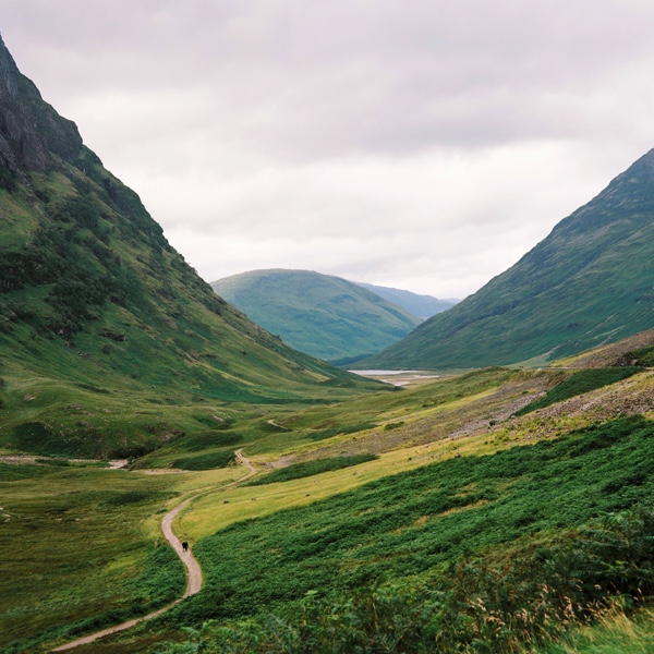
Want to see what the stock photos looked like when I started? These are all from the talented photographers at Unsplash.
